The data existed. It reached the CEO through five people, in five formats, about two weeks late, and shaped on the way.
Executive reporting4 min read
Sector, size, and function are stated. The client is not.
One metric published as a gap
At a glance
Sector
Consulting
Function
Executive reporting
Data cleaned first
Time recording, CRM, finance system, resource planner, engagement reviews
Hardest input
Definitions, three sessions
Published as a gap
Pipeline conversion by practice, data not trustworthy
Engagement
Definition work, then build, priced per phase
The short version
The monthly consolidation exercise disappeared
Five people no longer assemble five formats by hand, and nobody has asked for the old process back.
A follow-up question now costs nothing
Questions that used to take a week are answered the same day, and the second question no longer needs a meeting booked for it.
Definitional disputes happen once, upstream
The argument moved out of the monthly meeting and into a document with a date and an owner on it.
Why the delay was not the real problem
Getting a picture of the firm meant asking five people, then consolidating their answers by hand.
There was a second problem, and it was the real one. Numbers were being shaped before they reached the top. Not maliciously, mostly. But a utilization figure that arrives with an explanation from the person accountable for it is not the same thing as a utilization figure.
AI was selected to remove the delay and the intermediation together, and to let the CEO ask a follow-up without booking a meeting to get it answered.
Definitions, then extraction
The order here matters more than anything else on this page.
Interviews with the CEO and each function head.
Then definitions. Three sessions, and the hardest part of the project. What utilization means. When an engagement counts as booked. When revenue is recognized. And what a client is, when three subsidiaries buy separately and none of them mention the others.
Access rules were agreed in writing, including what the system shows and to whom. Two function heads pushed back hard on that document, and the argument took a fortnight to settle. It settled on the CEO seeing everything and function heads seeing their own function plus firm-level aggregates.
The data work dominated the timeline: extraction from five systems, entity resolution so a client is the same client everywhere, a common calendar so periods align, and historical restatement so trends survived a definitional change made two years earlier.
Gaps were documented rather than filled. One requested metric got dropped outright, and that turned out to be the decision the CEO cited most often afterward.
Recorded when the metric was dropped
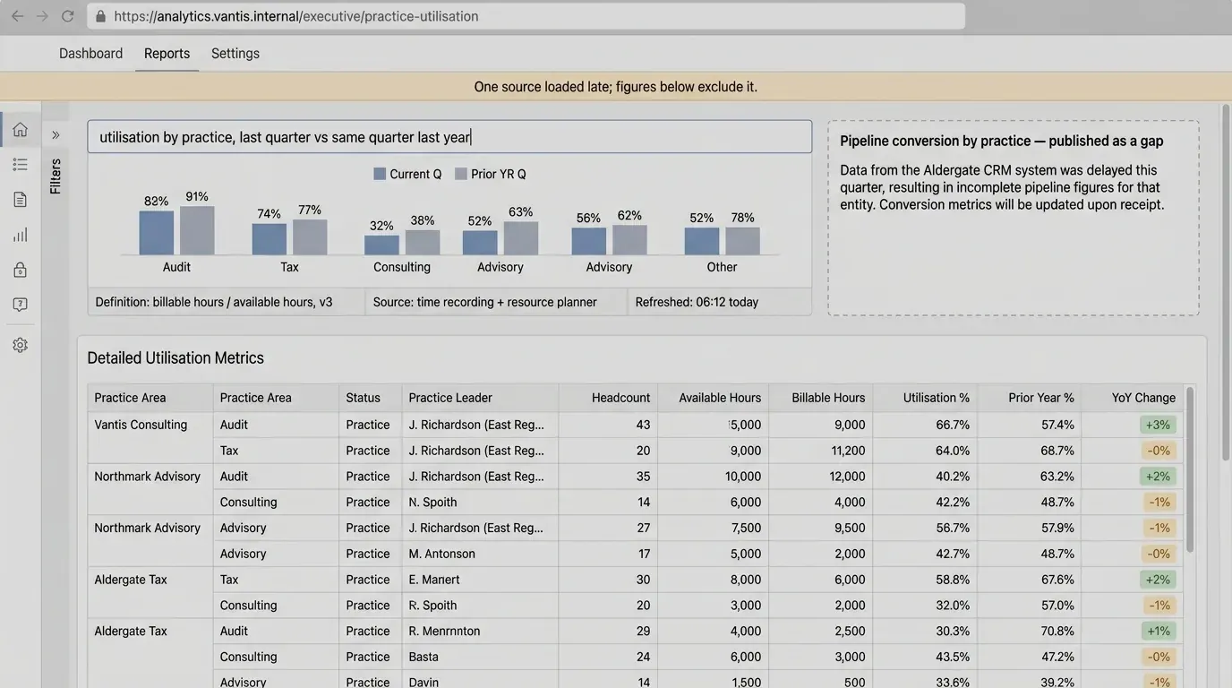
Pipeline conversion by practice cannot be computed from these sources at a quality anyone should act on. Approximating it would produce a number that looks authoritative and is not. It ships as a documented gap, with the reason attached.
bearingbridge.ai project record, phase Data
What was built, and what it admits
The architecture is unremarkable. That is intentional.
A consolidated store, a semantic layer over it, and a question interface on top.
Ask in plain language
No query syntax, no report request, no waiting on an analyst.
Every answer carries three things
The definition used, the source system, and the last refresh time.
Standard views cover board reporting
The recurring pack builds itself from the same definitions the ad hoc answers use.
Definition, source, refresh time, on every answer. The dashed tile on the right is the metric that was refused, with its reason attached.
When a source fails to load or data is stale, the answer says so rather than quietly serving yesterday.
Where it stands after a few months
The monthly consolidation exercise is gone, and nobody has asked for it back. Questions that used to take a week are answered the same day, and follow-ups cost nothing.
The firm’s own account of the change: arguments moved from whose spreadsheet was right to what the business should do.
The definitions are now owned by the finance director, reviewed quarterly. Months later the CEO was still using it daily, and two function heads had asked for their own view.
Three things that made it work
Definitions came before extraction
Three sessions of unglamorous argument, and without them the firm would have built a dashboard no one trusted and everyone worked around.
Provenance travels with every figure
Definition, source, refresh time. It is what makes a number usable in a board meeting rather than the opening of a debate about the number.
One gap got published
Refusing to approximate a single metric bought credibility for all the others, which is a trade most dashboards decline to make.
Figures on this page are client-verified and published with permission. Where a figure is absent, the outcome is described in operational terms instead.
A conversation with the senior team about your markets, your data, and where AI would actually pay back for you. No slides, no obligation, and if the honest answer is that AI is not your next move, you will hear that too.